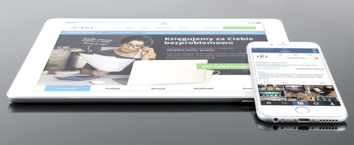
Web design has moved on from the gharish flashy sites paraded on the internet a few years back. Modern websites are clean, simple and attractive. Gone are the days of animated gifs, flashing buttons and overpowering background images. In vogue are flat wide designs with subtle backgrounds, natural colours and neat design concepts. Of course, fashions change and the web is continually evolving therefore it is important to keep abreast of the latest trends.
web design should be:
- Readable. Content is king and if what you have written cannot be read then your website is not doing its job properly.
- Modern, clean and tidy.
- Responsive. Looks good and works well on all screen sizes.
- Attractive. Easy to look at with the design enhancing functionality.
- Relative to your business, matching brand identities across media channels.

Designing a website
Here are a few things to consider when you are thinking about the design of your website, whether it’s a personal venture or a website for your business.
Think about the design elements that currently portray your business, e.g. any logos already created, leaflets or other literature, fonts, and the colours used. What elements do you like that you would like to incorporate in your website design?
Do some research online. Take a look at other websites for similar businesses or purposes and make a note of what you like and don’t like, what works well and what doesn’t. Make a list of the websites that you like the look of and the design elements you’d like to use in your own design. Colours, types of images, website look and feel, brochure style, magazine style etc. Remember that you can’t copy a design, but you can take ideas and turn them into your own design.
Using computer software or the old fashioned notepad and pen, sketch out a rough template of your design idea. Note colours, font styles and sizes, type of images and sizes and any features e.g. sliders that you’d like to incorporate.
You may need to choose web friendly fonts that are similar to those used in your printed material. These fonts are available for free for use on the web, take a look at Google Fonts, for a wide range of fonts. But remember not to use too many as it will harm your design. It is better to stick to two different fonts, a heading font and a body text font. This will keep your design clean and readable.
Once you have your design idea laid out you can start to convert it into a template using html and css, or pass it to your web designer who can advise you on the design and will help you to build the templates.
The final point to make is that whatever your website may look like, it must work properly. A visitor wants to find the answer to a question or information as quickly and as easily as possible. The functionality must give the visitor a seamless user experience and that will help to sell your services. At cannedSunlight, we ensure that this happens by testing your web design thoroughly in all browers on PCs and Macs, tablets and mobiles. If you need help with your website get in contact with us.


